Overview
During my internship at Steampunk, I contributed to the design and implementation of a multi-application design system for the DCMA, marking the organization’s initial use of PowerApps as a platform. I led efforts to ensure consistent, high-quality user interfaces across multiple applications, including modernizing the employee intranet with an emphasis on visual appeal. My responsibilities involved creating style guides, wireframes for eTools, and a public-facing application form, as well as conducting UX research and developing mockups and prototypes, all aimed at improving both internal and public-facing experiences.
To provide a detailed view of my work, here are links to the key projects I contributed to during my internship:
- Multi-Application Design System
- Employee Intranet Redesign
- Public-Facing Application Form
- Multi-Application Design System
- Employee Intranet Redesign
- Public-Facing Application Form
Multi-Application Design System
Challenge
The DCMA team at Steampunk needed a consistent design system to unify the look and feel across multiple applications on PowerApps, a new platform for both DCMA and Steampunk. Without a formal design system, each of the five applications was designed independently, leading to inconsistent styles and disorganized assets. Key UI elements, such as logos, typography, color schemes, buttons, and icons, were created separately by each designer, resulting in a disjointed experience.
Process
- Designed a unified set of icons to ensure visual consistency across platforms.
- Choose distinct color schemes for each app to keep unique identities within a cohesive system.
- Created final style guides and coordinated with the team to align designers and developers
- Choose distinct color schemes for each app to keep unique identities within a cohesive system.
- Created final style guides and coordinated with the team to align designers and developers
Outcome
The design system created a cohesive experience across DCMA’s applications, improving usability and reducing redundant design work. The centralized style guide allowed the team to build high-quality interfaces faster and adapt quickly to the PowerApps environment. DCMA now has a consistent, scalable UI foundation, improving user experience and team efficiency.
Modernized Iconography for Clear Visual Impact
By selecting a modern, professional icon set with a thicker outline, I enhanced visibility and added character, moving away from PowerApps' standard icons. This choice improved readability and gave the interface a more engaging, user-friendly look while maintaining professionalism.
Distinctive and Professional Color SystemDistinctive and Professional Color System
I recommended a palette of muted, desaturated tones that added variety to differentiate applications while aligning with the Department of Defense's standards. This ensured each application had a unique identity without compromising the cohesive, professional feel required for DCMA.
Comprehensive, Cohesive Style Guide
I developed a full style guide incorporating icons, typography, and colors, standardizing design elements across applications. This guide became a central reference for the team, ensuring visual consistency and streamlining the design process as new applications were developed.
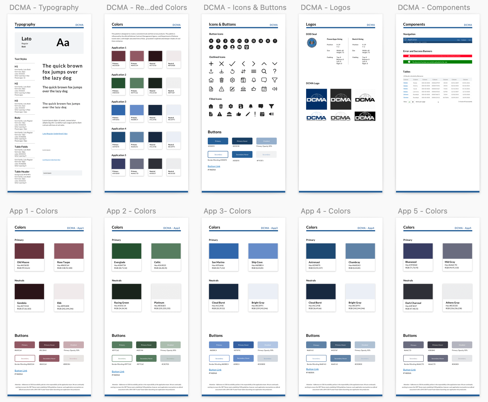
Final style guides using recommend colors
Employee Intranet Redesign: E-Tools
Challenge
DCMA has over 60 applications listed on a single-page homepage called E-Tools, requiring users to scroll to locate their desired application. Steampunk’s task was to design a more organized, user-friendly system for navigating these applications, improving accessibility for DCMA employees.
Goal
Create a Microsoft SharePoint homepage that enables users to easily locate the applications they need.
Process
- Conducted a card sort to identify common themes among applications.
- Explored various sorting and display options for efficient navigation.
- Designed homepage mockups in Sketch, focused on usability and organization.
- Explored various sorting and display options for efficient navigation.
- Designed homepage mockups in Sketch, focused on usability and organization.
Card Sorting Reduces Visible Application Cards
To better understand the applications, my teammate and I conducted a card sorting session using Lucid Chart. This exercise helped categorize the apps, uncovering overarching themes and functions. We explored various sorting options based on the platform’s capabilities and limitations. One suggestion was to transform certain applications, like training tools, into links featured in an update or news panel. This approach would reduce the number of visible application cards and streamline user navigation.
Designing an Intuitive Application Organization System
With user efficiency as the primary goal, I developed the initial mockups for the application organization system.
- Positioned the most frequently used applications at the top to ensure easy access for users.
- Designed various filtering options, including sorting by the first letter and displaying recently used applications, to enhance usability.
- Created categories for applications based on predetermined groups, simplifying navigation and improving discoverability for users
- Designed various filtering options, including sorting by the first letter and displaying recently used applications, to enhance usability.
- Created categories for applications based on predetermined groups, simplifying navigation and improving discoverability for users
Optimized Organization System Designed for Microsoft SharePoint
I designed a user-friendly organization system to streamline navigation across 60+ applications, reducing scrolling and search time for DCMA employees. I chose the accordion-style system because it would highlight the user’s preferred applications and also allow them to see the rest of the applications. The solution was tailored to Microsoft SharePoint's limited customization options, ensuring that it would work effectively within those constraints. In addition, I ensured adaptability in the design so that future applications could be easily added, allowing for growth and scalability.
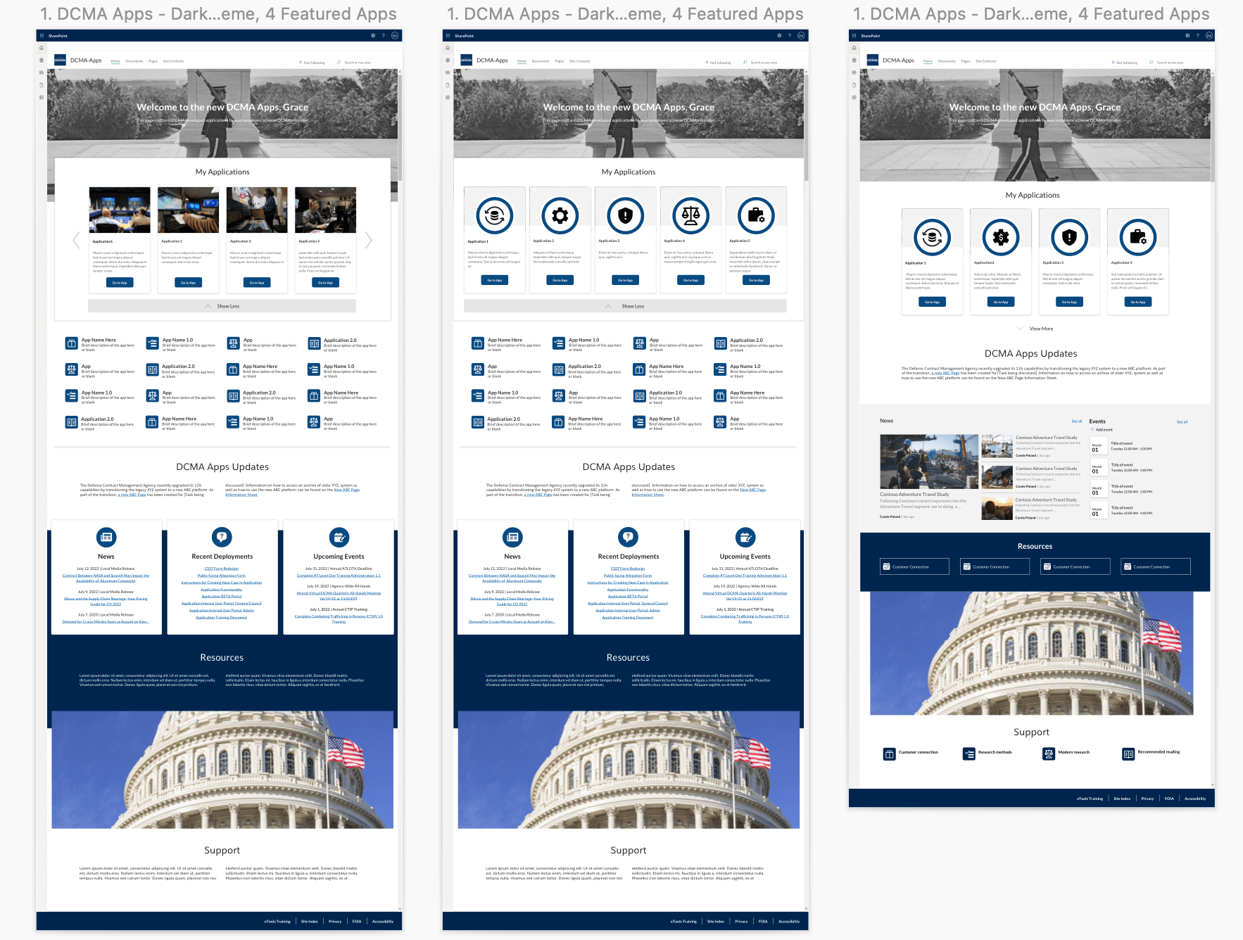
Various mockups that include SharePoint web parts
Public-Facing Important Capabilities List (ICL) Nomination Form
Challenge
Steampunk was tasked with developing a more accessible ICL nomination form to support the Department of Defense’s Mission Assurance program. The challenge was to make the nomination process easier for non-government users, who need a simple way to submit products for ICL consideration.
Goal
Reword the Important Capabilities List (ICL) nomination form so that it is easy for non-government officials to understand, enabling them to effectively nominate their products. This involved ensuring that the process is accessible to individuals without technical expertise in government or military terminology.
Process
- Transferred the internal form to a Microsoft mockup in Sketch.
- Presented the mockup to the client for feedback.
- Refined the wording to improve clarity and user comprehension.
- Presented the mockup to the client for feedback.
- Refined the wording to improve clarity and user comprehension.
User-Focused Design Iterations
I developed mockups in Sketch that mirrored Microsoft Forms' interface. The first draft retained the original fields but segmented the form into multiple pages for better navigation. Feedback from the client led to a second round of revisions, where I restructured questions to make them more user-friendly and less reliant on technical jargon.
Clarity Through Simplified Criteria
To help users understand the ICL qualifications, I introduced a series of yes or no questions that guided them through the nomination process. This approach not only clarified eligibility but also made the process of submitting their products for non-government users easier, ultimately enhancing participation in the ICL program.
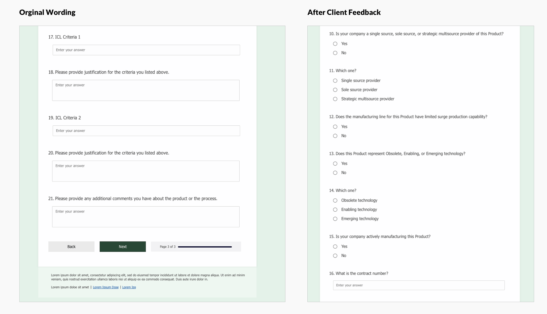
Left: Orginal form wording
Right: Wording after client feedback
Takeaways
The consolidation of the look and feel of Steampunk's DCMA applications allowed the client and the internal team to get a holistic view of the applications. As a result, similarities between the applications were identified and new color schemes were created to give each application a more distinct identity. The team was also able to apply consistent styling across applications ensuring that they all share similar UI.
In addition, I was able to create solutions for public-facing interfaces such as eTools. Additional projects like these show DCMA Steampunk's creative potential. The creation of an effective design system will make the design process for the new and upcoming applications more efficient and will give the client a better understanding of the applications being created and the work Steampunk was able to accomplish.